Monday, 29 February 2016
Evidencing of improvements to make the Third Drafts
FRONT COVER:
 |
| First, I elongated the red box for my cover line and stretched out the title to fit in the box better |
 |
| Second, I right-justified the Issue, Date and Price. |
 |
| Third, I moved up the white text into the red box. |
CONTENTS PAGE:
 |
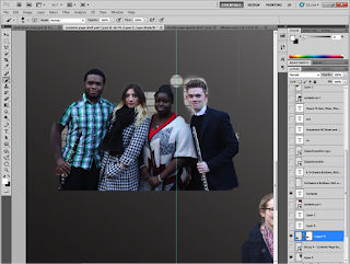
| First, I used the magnetic lasso to cut out the group. |
 |
| Second, I used the brush tools to make sure they were cut out perfectly and rounded properly. |
 |
| Third I moved them to each corner. |
 |
| Fourth, I started to move text around. |
 |
| Fifth, I drew a signature of the 'Editor' using the pen tool (Fountain Pen Icon) and then I wrote an Editor's Note. |
 |
| Sixth, I made the main article (The Double Page Spread) with a bigger font and a different font style to make it contrast from the rest of articles. |
 |
| Seventh, I used the Poly-Lasso tool to go around the tops of their heads. |
 |
| Eighth, I added their name. |
 |
| Ninth, I increased the size. But I decided to go with a normal name title as it would look a lot better and easier to understand. |
 |
| Finally, I made the left third BLACK and the middle and right thirds WHITE. This was to fit with my colour schemes of RED, WHITE and BLACK. |
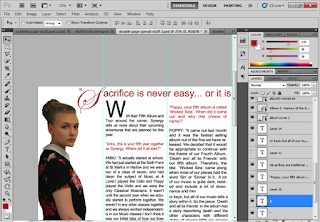
I didn't change my DOUBLE PAGE SPREAD. This is because I liked the way it looked and decided it didn't need anything else.
Wednesday, 24 February 2016
Friday, 19 February 2016
Editing after my First Draft of the Double Page Spread
Saturday, 13 February 2016
Editing after my First Draft of the Contents Page
 |
| First, I decided to change the background colour. |
 |
| Second I decided to have the colour change go diagonally from the bottom left to the top right. |
 |
| Third, I started to move around the articles and photos. |
 |
| Fourth, I changed the font size and style of the 'Contents' |
 |
| Fifth, I took the red box from the FRONT COVER and then made a copy and put it in the contents page. |
 |
| Sixth, I put it with the 'Contents' |
 |
| Seventh, I went round the group and cut them out with the Magnetic Lasso Tool and then made sure they were cut out perfectly using the brush tool. |
 |
| Eighth, I moved round the title and photos. |
 |
| Ninth, I added a caption for the photos. |
Thursday, 4 February 2016
Editing AFTER my First Draft of the Front Cover
 |
| First, I changed some of the colouring of the fonts to white. |
 |
| Second, I looked at the colour and filters of the photo used. |
 |
| Third, I added a red box and made it translucent. |
 |
| Fourth, I changed the font of the Cover Line. |
 |
| Fifth, I added 'Anbu and Poppy' |
 |
| Sixth, I rotated 'Anbu and Poppy' |
 |
| Seventh, I made a red puff to put the inducements in |
Subscribe to:
Comments (Atom)


