FRONT COVER:
 |
| First, I elongated the red box for my cover line and stretched out the title to fit in the box better |
 |
| Second, I right-justified the Issue, Date and Price. |
 |
| Third, I moved up the white text into the red box. |
CONTENTS PAGE:
 |
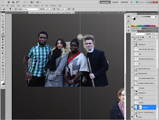
| First, I used the magnetic lasso to cut out the group. |
 |
| Second, I used the brush tools to make sure they were cut out perfectly and rounded properly. |
 |
| Third I moved them to each corner. |
 |
| Fourth, I started to move text around. |
 |
| Fifth, I drew a signature of the 'Editor' using the pen tool (Fountain Pen Icon) and then I wrote an Editor's Note. |
 |
| Sixth, I made the main article (The Double Page Spread) with a bigger font and a different font style to make it contrast from the rest of articles. |
 |
| Seventh, I used the Poly-Lasso tool to go around the tops of their heads. |
 |
| Eighth, I added their name. |
 |
| Ninth, I increased the size. But I decided to go with a normal name title as it would look a lot better and easier to understand. |
 |
| Finally, I made the left third BLACK and the middle and right thirds WHITE. This was to fit with my colour schemes of RED, WHITE and BLACK. |
I didn't change my DOUBLE PAGE SPREAD. This is because I liked the way it looked and decided it didn't need anything else.
No comments:
Post a Comment